The annual time tracking overview provides a comprehensive display of work hours over an extended period, featuring detailed navigation, filtering options, and both graphical and tabular analysis capabilities.
Navigation
You can find the Annual Overview at:
Navigation bar → Clock symbol (in the right section) → Show hours overview → Annual Overview

Figure: Access time tracking
Overview
The Annual Overview displays all hour entries of the logged-in employee for a selected period in a combined graphical and tabular view. It enables you to:
- get a quick overview of hours worked across the selected period
- visualize the distribution of hours over time in a chart
- group the display by Customers, Categories, or Orders
- compare Actual Hours, Working Hours, and the Difference per month
- evaluate totals and averages over the selected period
- switch to any other employee's overview with ease (requires the View All Hours permission)
Settings
Tabs
The tab navigation at the top of the page offers the following views:
- Actual – entries from the last 90 days
- Weekly Overview – detailed weekly breakdown
- Annual Overview – graphical and tabular evaluation over a longer period
- Hours / Day – hour overview per working day
Note: The Vacation Days tab is only displayed if a vacation category is configured.
Filters
The following filters are available above the chart. Confirm your selection with the view button.
- Display Mode: Use the first dropdown to switch between Monthly Overview and further display options (Weekly Overview, Quarterly Overview, Annual Overview).
- Period: Use the second dropdown to select the period to be displayed (e.g. Last 6 Month, 2026, or an individual date range).
- Employee: Use the third dropdown to select a specific employee. This filter is only visible to users with the View All Hours permission.
- Grouping: Use the fourth dropdown to switch the display between Customers, Categories, and Orders.
Graphical Display
The area chart visualizes the development of hour entries over the selected period:
- The Y-axis (Hourly entries) shows the number of hour entries.
- The X-axis shows the breakdown of the selected period.
- If multiple customers, categories or orders are present, each is represented by its own colored area or line.
- The legend below the chart assigns the colors to the respective customers, categories or orders.
- Hours without assignment and Residue are shown separately.
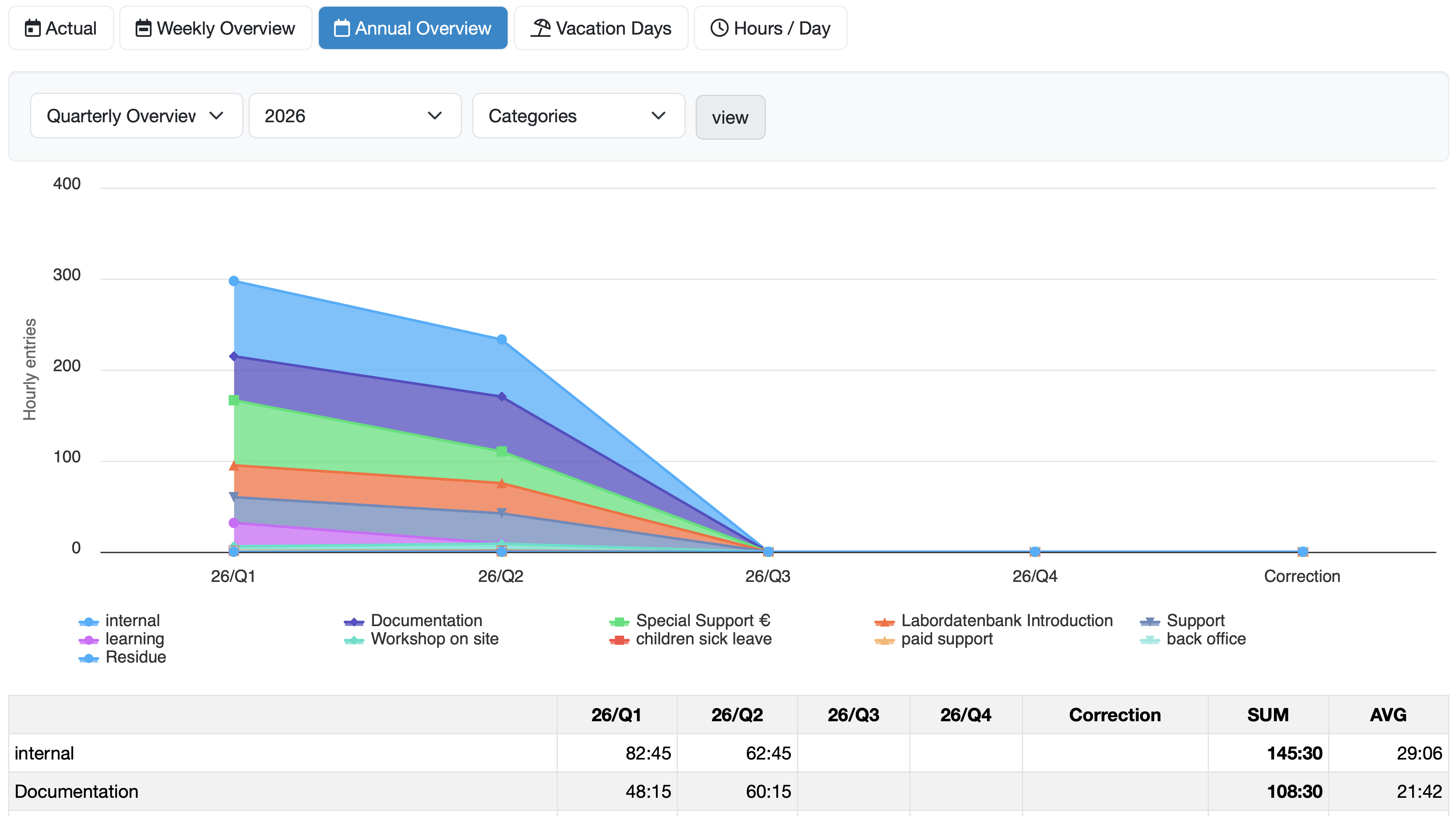
Figure: Quarterly Overview of categories in the area chart
Description of the Tabular Overview
The data is summarized in a table below the chart:
- The rows list the customers, categories or orders to which hours have been assigned. Names highlighted in blue are clickable links to the respective view.
- The columns correspond to the individual sections of the selected period, as well as the columns SUM (total sum) and AVG (average).
- An additional Correction column is displayed if correction bookings are present.
- Entries without assignment are shown in a separate row.
The following summary rows are displayed at the bottom of the table:
- Actual hours – actually recorded hours per month
- Working days – number of working days in the respective month
- Working hours – stored working time specification per month
- Difference – difference between Actual hours and Working hours per month
Related Topics: